
PMO dashboards are integrated visual tools that consolidate project portfolio data into a single command centre, giving project managers and business stakeholders the real-time oversight needed to make faster, better-informed decisions. If you are managing multiple projects across teams and still relying on weekly status emails or disconnected spreadsheets, you are operating with a significant blind spot. Tools like Power BI and Clarity PPM have demonstrated that pulling diverse data into a live, interactive view enables early systemic risk detection that periodic reports simply cannot match. The case for why use PMO dashboards is not theoretical. It is grounded in the measurable gap between reactive reporting and proactive governance.
Why use PMO dashboards to unify fragmented project data
The most common failure in project reporting is fragmentation. Teams maintain separate spreadsheets, project managers update different tools, and executives receive status reports that are already outdated by the time they arrive. This creates a trust problem: nobody is confident they are looking at the same version of reality.
PMO dashboards solve this by acting as a single source of truth, pulling live data from tools like Jira, MS Project, and Excel into one unified view. The result is that portfolio health and financial status appear at the top level, project performance sits in the middle tier, and drill-down details are available on demand. This layered architecture, as described by Mary Ludwig, guides users from portfolio summary down to project specifics in a natural narrative flow.

The practical benefit is a sharp reduction in reporting friction. Project managers spend less time chasing status updates and more time acting on the information they already have. The table below illustrates the contrast clearly.
| Reporting approach | Data currency | Time to insight | Risk of misalignment |
|---|---|---|---|
| Fragmented spreadsheets and emails | Days to weeks old | High effort | Very high |
| PMO dashboard with live integration | Hours or real time | Low effort | Low |
Pro Tip: When connecting data sources to your dashboard, prioritise the tools your team already uses daily. Forcing a new data entry workflow defeats the purpose of automation and reduces data quality over time.
Which metrics should PMO dashboards track?
The temptation when building a PMO dashboard is to include every available metric. This is one of the most common and damaging mistakes in dashboard design. Excessive metrics cause information overload and reduce the dashboard's effectiveness, pushing users to ignore it entirely.
Tanya Roberts, cited by IPM Insight, argues that portfolio teams should agree on a few North Star metrics tied directly to expected project benefits. These are the metrics that answer whether your portfolio is delivering value, not just whether tasks are being completed. High-performing dashboards limit KPIs to those answering whether projects are on track, on budget, and aligned to strategy. Everything else belongs in drill-down views.
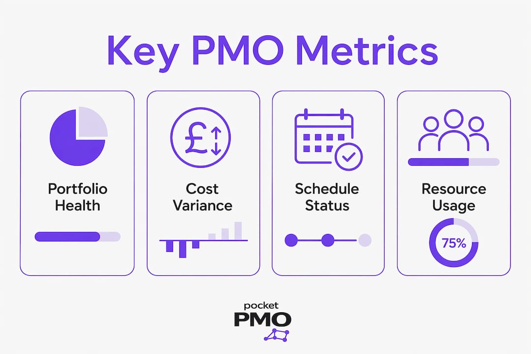
The must-have metrics for an effective PMO dashboard include:
- Portfolio health score: an aggregated view of red, amber, and green status across all active projects
- Cost variance: the difference between budgeted and actual spend, tracked at both project and portfolio level
- Schedule variance: deviation from planned milestones, expressed in days or percentage of elapsed time
- Resource utilisation: the ratio of planned to actual effort across your team, identifying over-allocation and idle capacity
- Risk likelihood and impact scores: scored risk factors that surface the highest-priority threats before they escalate
- Benefit alignment index: a measure of how closely each project's current trajectory matches its original business case
Pro Tip: Review your dashboard metrics with stakeholders every quarter. Metrics that were relevant at project initiation often lose meaning as the portfolio evolves. Removing outdated KPIs is as important as adding new ones.
How real-time updates make PMO dashboards worth implementing
Traditional status reports are snapshots. By the time a project manager compiles a weekly update, reviews it, and distributes it, the data is already stale. A project that was amber on Monday may be deep red by Thursday, and nobody knows until the next reporting cycle.
Continuous visibility with daily or hourly updates allows variances to be spotted and addressed before they escalate into delivery failures. Project control dashboards that refresh automatically act as live command centres for schedule, cost, quality, risk, and resource monitoring. This is the operational difference between managing a project and watching it unfold.
Resource capacity planning is where real-time data delivers some of its clearest returns. Clarity PPM, for example, updates resource effort automatically when tasks or timesheets are modified, giving project leaders a dynamic view of labour allocation without manual intervention. When a key resource is approaching over-capacity, the dashboard surfaces the signal immediately, not at the next steering committee.
| Update frequency | Typical use case | Decision speed |
|---|---|---|
| Weekly manual report | Executive governance packs | Slow, reactive |
| Daily automated refresh | Project manager oversight | Moderate, responsive |
| Hourly or near real-time | Active delivery and risk monitoring | Fast, proactive |
Common pitfalls of PMO dashboards and how to avoid them
A well-designed dashboard does not guarantee good decisions. Many dashboards create what Forbes describes as an illusion of control: they display data clearly, but because they are inherently backward-looking, they require human interpretation and deliberate action to produce any outcome. The structural delay between signal detection and decision execution is where projects continue to fail, even in organisations with sophisticated dashboards.
Poor information architecture compounds this problem. When a dashboard groups metrics by data category rather than by the decisions stakeholders need to make, users cannot intuitively connect what they see to what they should do. GB Advisors recommends building dashboards around specific decisions, excluding irrelevant data to improve the speed and quality of responses. Layouts that reflect operational reality build user trust and coherence, rather than fragmenting understanding across isolated metric categories.
The most common pitfalls to avoid are:
- Displaying too many KPIs at the top level, forcing users to scan for what matters
- Building dashboards without involving the stakeholders who will use them daily
- Treating the dashboard as a finished product rather than an evolving tool
- Failing to connect metrics to the decisions they are meant to support
- Allowing widgets to accumulate without reviewing whether they still serve a purpose
Pro Tip: Run a quarterly dashboard audit with your key stakeholders. Ask one question: "Which of these metrics changed a decision you made in the last 90 days?" Remove anything that cannot answer yes.
How PMO dashboards improve stakeholder communication and governance
One of the most underappreciated benefits of PMO dashboards is the reduction in meeting volume. When every stakeholder has access to the same up-to-date portfolio view, the standard "what is the status of X?" conversation becomes unnecessary. Layered dashboard views serve executives and project leads alike, with each audience seeing the level of detail relevant to their role without needing a separate briefing.
For executives, the dashboard surfaces portfolio-level health, funding allocation, and strategic alignment at a glance. For project managers, it provides schedule and resource detail. This separation of concerns means governance conversations shift from status updates to decisions. Steering committees can focus on prioritisation and risk response rather than spending the first 20 minutes of every meeting establishing where things stand.
Portfolio balancing also becomes more disciplined. When you can see the full mix of project types, their relative risk profiles, and their alignment to strategic objectives in one view, funding and resourcing decisions are grounded in evidence rather than advocacy. AI-assisted scoring, as offered by platforms like Pocketpmo, adds another layer by surfacing which projects are most likely to deliver their stated benefits, supporting prioritisation with data rather than instinct.
The governance and communication enhancements that well-implemented dashboards deliver include:
- Faster escalation of risks and issues to the right decision-makers
- Consistent, shared understanding of portfolio status across all stakeholder groups
- Reduced preparation time for governance meetings and steering committees
- Evidence-based prioritisation of funding and resource allocation
- Clearer audit trails for project decisions, supporting accountability and compliance
- Improved alignment between project delivery teams and executive strategy
For practical guidance on structuring these governance workflows, the PMO decision-making guide from Pocketpmo covers how AI-assisted insights accelerate leadership decisions across complex portfolios.
Key takeaways
PMO dashboards deliver their greatest value when they are designed around the decisions stakeholders need to make, not around the data that happens to be available.
| Point | Details |
|---|---|
| Unified data source | Connecting Jira, MS Project, and Excel into one view eliminates reporting friction and misalignment. |
| Limit KPIs to North Star metrics | Track portfolio health, cost variance, resource utilisation, and benefit alignment. Remove the rest. |
| Real-time updates enable proactive control | Daily or hourly data refresh surfaces variances before they escalate into delivery failures. |
| Design around decisions, not data | Structure dashboards to reflect operational reality and the specific choices stakeholders must make. |
| Governance becomes faster and evidence-based | Shared, live portfolio views reduce meeting volume and ground prioritisation in facts. |
The case for dashboards that actually change behaviour
I have seen organisations invest heavily in dashboard tooling and still run their governance meetings from a PowerPoint deck compiled the night before. The dashboard existed. Nobody trusted it enough to use it.
The problem was not the technology. It was that the dashboard had been built by someone who understood data, not by someone who understood how decisions get made in that organisation. The metrics on screen did not map to the questions the steering committee was actually asking. So people reverted to what they knew.
The importance of PMO dashboards is not in their existence. It is in their adoption. A dashboard that reflects how your organisation actually governs projects, that surfaces the three or four signals that genuinely change what a leader does next, will be used. One that displays 40 metrics in a colour-coded grid will be ignored within a month.
The shift from reactive to proactive management does not happen because you installed a dashboard. It happens because you designed one that makes the right action obvious. That requires stakeholder involvement from the start, iterative refinement, and the discipline to remove metrics that do not drive decisions. It also requires someone to own the dashboard as a living tool, not a one-time deliverable.
If you are exploring AI-powered PMO reporting, the most important question to ask is not "what can this tool show me?" It is "what decision does this help me make faster?"
— Danny
See PMO dashboards in action with Pocketpmo
Pocketpmo is built specifically for project managers and PMO leaders who need real-time portfolio visibility without the overhead of building and maintaining a dashboard infrastructure from scratch.
The platform delivers live project dashboards, AI-driven risk scoring, and resource utilisation views that update automatically as your team works. Metrics are pre-configured around the decisions that matter most, so you are not starting from a blank canvas. For teams comparing options, the Pocketpmo vs Monday.com page details how the dashboard and governance features compare directly. To explore the full platform and see how it fits your portfolio, visit the Pocketpmo launch page and request a walkthrough.
FAQ
What is a PMO dashboard?
A PMO dashboard is a visual tool that consolidates data from multiple projects into a single portfolio view, giving project managers and executives real-time insight into health, cost, schedule, and risk across their entire programme.
How do PMO dashboards improve decision-making?
PMO dashboards surface key metrics tied to business outcomes, allowing leaders to identify variances and prioritise responses without waiting for manual status reports. The best designs focus on a small number of North Star metrics rather than displaying every available data point.
What metrics should a PMO dashboard include?
Effective PMO dashboards track portfolio health scores, cost variance, schedule variance, resource utilisation, risk likelihood scores, and benefit alignment. Metrics that do not directly inform a governance decision belong in drill-down views, not the top-level summary.
Why do some PMO dashboards fail?
Many dashboards fail because they display data without connecting it to specific decisions, creating an illusion of control. Poor information architecture, too many KPIs, and lack of stakeholder involvement in the design process are the most common causes of low adoption.
How often should PMO dashboards be updated?
For active project delivery, daily or near real-time updates are the standard. Tools like Clarity PPM refresh resource and task data automatically when timesheets or assignments change, removing the need for manual data entry and keeping the dashboard accurate throughout the working day.