

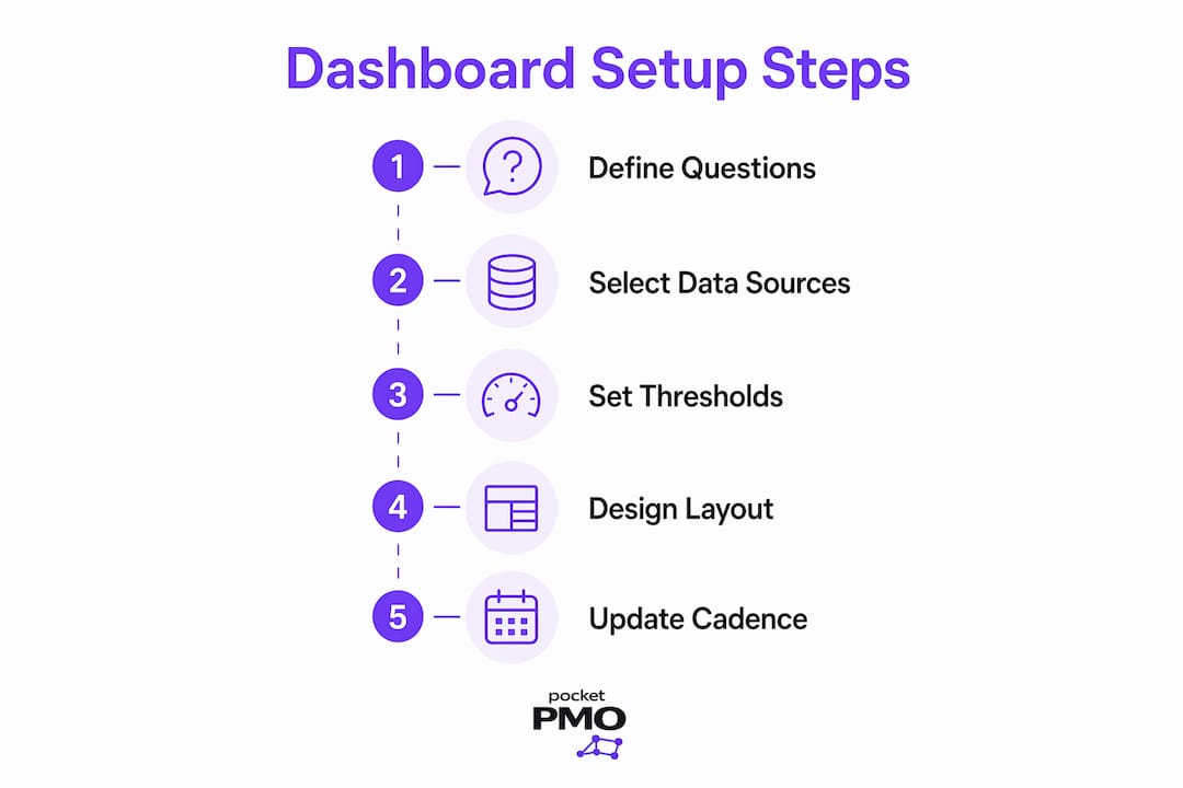
A project dashboard is a visual management tool that delivers at-a-glance project health data to support informed decisions and performance monitoring. Unlike a status report, which captures a moment in time, a well-built dashboard is a live communication tool that evolves with your project. This project dashboard setup guide covers every critical step: defining purpose, selecting data sources, setting RAG thresholds, designing layout, and maintaining update cadence. Follow these steps and your dashboard will drive action, not just awareness.
What questions should your project dashboard answer?
The foundation of any effective dashboard is a clear set of questions it must answer. Defining the dashboard's purpose starts with identifying the five critical questions your project sponsor asks at every steering committee meeting. Those questions typically cover schedule status, budget position, key risks, upcoming milestones, and decisions needed. Every widget, chart, and metric on your dashboard should map directly to one of those five questions.
Engage your key stakeholders before you configure a single panel. Ask your sponsor, steering committee members, and delivery leads what they need to know at a glance. Their answers will differ by role. A sponsor wants a red, amber, or green (RAG) summary and a decision log. A delivery lead wants milestone progress and resource blockers. Tailoring the dashboard by audience prevents you from building a generic view that serves nobody well.

Pro Tip: Run a 30-minute workshop with your steering committee before setup. Ask each member to write down their top three questions. Use the overlap to define your dashboard's five core metrics.
Once you have your five questions, write them down and pin them to your configuration checklist. Every time you consider adding a new metric, ask whether it answers one of those questions. If it does not, leave it out.
How do you select data sources and set thresholds?
Data accuracy is the single biggest factor in whether stakeholders trust your dashboard. Automate data integration from your systems of record, such as your project scheduling tool, financial system, and risk register. Manual entry quickly produces obsolete figures, and a dashboard with stale data is worse than no dashboard at all. Stakeholders who spot one inaccuracy will question everything else on the screen.
Once your data feeds are live, define clear thresholds for each KPI. Thresholds convert raw numbers into actionable signals. The table below shows the standard RAG thresholds used by most governance frameworks.
| Metric | Green | Amber | Red |
|---|---|---|---|
| Schedule variance | Within 2 weeks of plan | 2–4 weeks behind plan | More than 4 weeks behind |
| Budget variance | Within 5% of plan | 5–10% over plan | More than 10% over plan |
| Risk exposure | Low, mitigated | Medium, being managed | High, unmitigated |
| Milestone completion | On track | At risk | Missed |
Clearly defined RAG thresholds promote a shared understanding between sponsors and project managers, preventing misinterpretation of data. Without agreed thresholds, one stakeholder reads amber as "fine" while another reads it as "crisis." Publish your threshold definitions alongside the dashboard so every viewer interprets the signals the same way.
Pro Tip: Store your threshold definitions in a single reference document linked directly from the dashboard. When a stakeholder questions a RAG rating, you can point them to the agreed criteria in seconds.
For project status reporting that feeds your dashboard, connect your scheduling tool as the primary source for schedule data and your finance system for budget data. Never allow project managers to manually override automated feeds without a documented reason.
How should you design your dashboard layout for clarity?
Layout determines whether your dashboard gets used or ignored. A top-down layout places urgent metrics at the top of the screen, so a steering committee member opening the dashboard sees the most critical information within three seconds. RAG status, budget variance, and the next key deadline belong in the top row. Secondary detail sits below.
Follow these layout principles when configuring your panels:
- Place RAG indicators, budget variance, and the nearest milestone deadline in the top row.
- Use a single colour per RAG status: green, amber, and red only. Avoid gradients or additional colours that require a legend.
- Limit the dashboard to five critical questions. Dashboards overloaded with metrics tend to be ignored by the very people they are designed to serve.
- Use bar charts for budget comparisons, Gantt-style bars for schedule, and simple traffic lights for RAG. Avoid pie charts for anything time-sensitive.
- Group related metrics together. Schedule and milestone data sit in one panel; budget and cost data in another; risks and issues in a third.
Visual hierarchy is not decoration. It is a decision-making aid. When a steering committee member opens your dashboard mid-meeting, they should reach a conclusion about project health before they finish reading the first row. If they need to scroll or hunt for the RAG status, the layout has failed.
A free RAG status template from Pocketpmo can give you a pre-built structure to adapt, saving you the time of designing threshold logic from scratch.
What update cadence keeps your dashboard relevant?
A dashboard that is not current is not a dashboard. It is a historical document. The update frequency must match or exceed your governance cycle.
- Identify your governance rhythm. If your steering committee meets monthly, your dashboard needs updating at least weekly. Monthly governance requires weekly updates to catch emerging problems before they become escalations.
- Set a fixed update day. Choose a consistent day each week, such as every Monday morning, for data refresh. Consistency builds stakeholder habit. They know when to check and trust that the data is fresh.
- Integrate updates with your team's workflow. Tie the dashboard refresh to your weekly team meeting. Project managers report their status, the dashboard updates, and the steering committee receives a current view before their next session.
- Schedule a monthly dashboard review. Regular reviews and refinements keep the dashboard fit for purpose as the project evolves. A metric that mattered in month one may be irrelevant by month four.
- Archive previous snapshots. Keep a dated record of past dashboard states. This gives you a clear audit trail and helps you spot trends over time, such as a budget that drifts amber every third week.
Infrequent updates mask problems. A project that looks green on a two-week-old dashboard may have turned red three days ago. Governance decisions made on stale data carry real delivery risk. For practical guidance on tracking project status in real time, build your update routine before you launch the dashboard to stakeholders.
What pitfalls should you avoid when setting up a dashboard?
The most common mistake is treating the dashboard as a static report. Dashboards misused as static reports shift conversations away from action and toward status recitation. The goal is to move discussions from "where are we?" to "what do we need to do about it?" Open every steering committee meeting with the dashboard on screen and let it drive the agenda.
Avoid these specific errors:
- Overloading metrics. More than five critical questions creates visual noise. Practitioners consistently find that too many metrics cause stakeholders to disengage entirely.
- Skipping threshold documentation. Undefined thresholds mean each viewer interprets RAG ratings differently, which erodes trust.
- Allowing manual data entry. Even one manually entered field introduces doubt about the integrity of automated fields. Keep all data feeds automated.
- Building once and never revisiting. A dashboard that was perfect at project initiation will be misleading by delivery phase if nobody refines it.
Pro Tip: At the end of every steering committee meeting, ask one question: "Did the dashboard give you what you needed today?" The answers will tell you exactly what to fix before the next session.
Consulting frameworks from organisations like Leanscape reinforce this point: dashboards that actively support meetings, rather than sitting as background documents, produce faster and better-informed decisions. Embed the dashboard into your standard governance workflow from day one.
Key takeaways
A well-designed project dashboard answers five sponsor questions, uses automated data feeds, applies clear RAG thresholds, and updates at least as often as your governance cycle demands.
| Point | Details |
|---|---|
| Define five core questions | Identify what your sponsor and steering committee need to know before configuring any metric. |
| Automate all data feeds | Connect systems of record directly; manual entry degrades accuracy and stakeholder trust. |
| Set published RAG thresholds | Use standard schedule and budget bands so every viewer interprets status signals the same way. |
| Match update frequency to governance | If steering committees meet monthly, refresh the dashboard at least weekly to catch problems early. |
| Treat the dashboard as a live tool | Open every governance meeting with the dashboard on screen to shift discussions from status to action. |
Why most dashboards fail before they even launch
The honest truth, after years of working with project managers across complex programmes, is that most dashboards fail at the design stage, not the technical stage. Teams spend hours choosing chart types and colour schemes, then launch a dashboard that nobody uses because it answers questions nobody actually asked.
The single most effective thing I have seen a project manager do is spend 45 minutes with their sponsor before touching any configuration. Not a survey. A conversation. Ask what keeps them up at night about this project. The answers will be specific, personal, and far more useful than any generic dashboard template.
I have also seen the opposite: technically perfect dashboards with live data feeds, automated RAG ratings, and beautiful layouts that get ignored because the project manager never made them part of the meeting rhythm. A dashboard that lives in a shared drive and gets checked once a fortnight is not a management tool. It is a filing cabinet.
The PMO dashboard guide from Pocketpmo captures this well. The technology is the easy part. The discipline of opening every governance meeting with the dashboard on screen, of asking "what does this tell us and what do we do next?", is what separates teams that use dashboards from teams that merely have them.
Iterate. After every steering committee session, spend ten minutes asking whether the dashboard served the discussion. If a metric never came up, remove it. If a question went unanswered, add a panel. The best dashboards I have seen are never finished. They grow with the project.
— Danny
How Pocketpmo supports your project dashboard setup
Pocketpmo is built for project managers who need real-time portfolio visibility without the overhead of building a PMO from scratch.
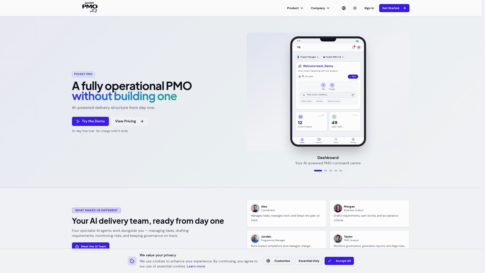
The platform integrates real-time dashboards with automated data feeds, pre-configured RAG thresholds, and governance-aligned reporting, so you spend less time configuring and more time managing. Status updates, risk tracking, and milestone monitoring connect directly to your steering committee rhythm. If you want a fully operational PMO without building one internally, Pocketpmo delivers dashboard functionality, AI-driven risk analysis, and portfolio management from day one. Explore the platform and see how it fits your governance cycle.
FAQ
What is a project dashboard?
A project dashboard is a visual management tool that displays key project metrics, such as RAG status, budget variance, and milestone progress, in a single view to support fast, informed decisions.
How many metrics should a project dashboard display?
Limit your dashboard to answering five critical questions. Dashboards with more than five core metrics create visual noise and are frequently ignored by stakeholders.
How often should a project dashboard be updated?
Update your dashboard at least as frequently as your governance cycle. If your steering committee meets monthly, the dashboard requires at least weekly updates to remain accurate and actionable.
What are standard RAG thresholds for a project dashboard?
Schedule thresholds are green within 2 weeks of plan, amber 2–4 weeks behind, and red more than 4 weeks behind. Budget thresholds are green within 5% of plan, amber 5–10% over, and red more than 10% over.
Why should dashboards be used during meetings?
Using the dashboard as a live reference during steering committee meetings shifts discussions from status recitation to action planning, which produces faster and better-informed decisions.